


Heat Map Excel Template Downloads
What is a Heat Map?
A heat map is a graphical representation that uses color-coding to visualize data values within a matrix or table. It allows for easy interpretation of complex information by assigning colors to different values, making patterns, correlations, or variations instantly recognizable.
Heat Map Excel Template
Heat Map Excel Template
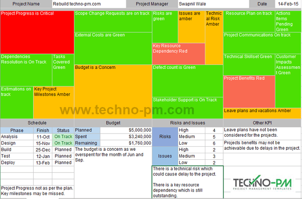
The heat map template is simple to use. The heat map is divided into 4 sections - Schedule, Budget, Risks and Issues, and Other KPIs. Each section comprises multiple categories or subsections that refer to the key performance measures for the reporting. The bigger the subsection higher the significance of that subsection. Each subsection can be colored to reflect its status. The subsection uses conditional formatting and will be colored as per the keyword used. Below is the list of keywords and corresponding colors.
Use the relevant keyword in the status update to color as per below -
- Use the keyword "Critical" to color the subsection bright red. This status is used when things are really, really bad.
- Use the keyword "Red" or "Delayed" to color the subsection light red. This status should be used when the situation is bad and out of control.
- Use the keyword "Amber" or "Concern" to color the subsection in Amber. This status should be used when things look like going south.
- Use the keyword "Green" or "On Track" to color the subsection in Green. This status should be used when all is good.
Examples of Using Keywords In The Project Heat Map Excel Template
- Project Progress is Critical - will color the subsection in bright red.
- Key Resource Dependency Red - will color the subsection in light red.
- Project Benefits delayed - will color the subsection in light red.
- Scope Change Requests are on track - will color the subsection in green.
- Risks are green - will color the subsection in green.
- Leave plans and vacations Amber - will color the subsection in amber.
- Budget is a Concern - will color the subsection in amber.
Excel Risk Heatmap
To supplement the heat map with information, the excel template contains additional sections to provide details or comments. The schedule sections can cover key project phases with end dates and status. There is also a section to enter any comments related to issues visible in the heat map. The budget section has basic information about the budget and a comments section to provide any additional information about the heat map issues. The risks and issues section has the count for risks and issues. In addition to the basic details, it also has a comments section. The other KPIs section can contain comments about other issues visible in the heat map.
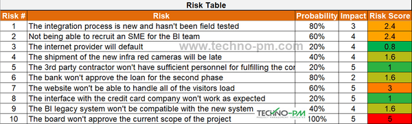
The risk heat map is used to graphically present the projects’ risks in a 5X5 matrix, where the bottom left cell is the least serious risk and the top right is the most severe. Each risk is entered into the risk table and is assigned two parameters. A probability for occurrence, in increments of 20% (20%, 40%, 60%, 80%, or 100%) and an impact on the project should the risk materialize, in increments of 1 (1,2,3,4 or 5), 5 being the most severe. The multiplication of these two parameters is called the “Risk Score” and appears in column E. The heatmap conditional formatting is applied to the risk score column, and each risk number is represented in the table according to the score.
The heatmap parameters are as follows –
- The lowest number is the most Green.
- The middle percentile is 60% and appears as Orange.
- The highest number is the most Red.
Excel Risk Heatmap
Heatmap Template in PowerPoint(PPT)
The Heat Map Template PPT example is a heat map of the number of cars in a certain dealership, split into car types and the quarter in which they were sold. It is manually colored, and each change of the numbers results in a new coloring scheme. While conceiving the scheme of the heatmap, the following parameters were adhered to –
- The Reddest cells were the lowest values in the table.
- The Orange cells are the ones that are closest to the 50th percentile (i.e., the closer the cell value is to the average, the more orange the cell is).
- The Greenest cells were the highest values in the table.

Heatmap Template PPT
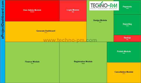
High-Level Heat Map
The high-level heat map can be used to display the status of the project components or phases. The size of each cell depends on the size of the component. Enter the Module Name on the top and the status below the module name. This heat map sample is for a website building project. Hopeless = Dark Red, Bad = Light Red, Worry = Yellow, Good = Green and Great = Dark Green.
High-Level Heat Map Template
List Heat Map
The list heat map template is a simple list of items. Each cell will have a name and then status. Use the following status. A list heat map is a good tool for tracking a list of items that need to be completed. I have used Project Management Toll Review as an example. Green Status = Green Color. Amber Status = Amber Color and Red Status = Red Color.
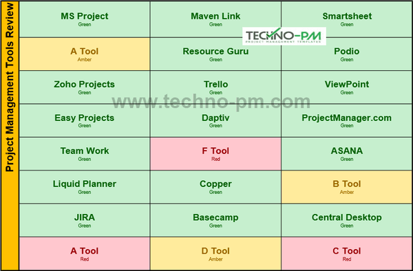
List Heat Map Template